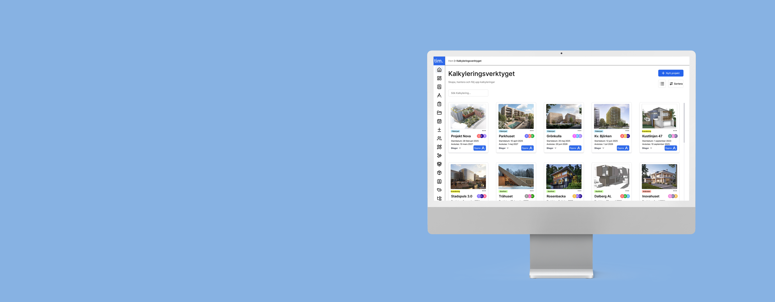
A calculation and digital construction tool that combines floor plan drawings, measurements, surface calculations and deductions in one platform.
Timpunkt
BACKGROUND
This project was carried out in collaboration with Uptilt, a company specializing in digital development and design. The assignment was referred through Timpunkt, a provider of digital solutions for construction estimation and documentation. The end client for the project was EVKA Golv & Fasad AB – a small construction company that, like many others in the industry, relies on several separate tools for estimation, floor plan creation, quotation preparation, and invoicing. The systems currently in use, such as Bluebeam, are both costly and time-consuming, leading to increased administrative burden. This highlighted the need for a unified tool, which led to the design of a solution capable of combining these functionalities into one integrated platform
DETAILS
Team: 5 students
Role: UX/UI designer, UX researcher, Product designer
Duration: 6 months
Tools: Figma, Miro, Canva
THE PROBLEM
Small to medium-sized construction companies often lack a single, cost-effective solution to manage their workflow. Instead, they rely on multiple expensive and separate software tools, leading to inefficiencies, increased costs, and duplicated efforts. There is a clear market need for a tailored system that integrates key functions such as calculations, drawings, and quotations into one user-friendly platform.
THE SOLUTION
The goal of the project was to develop a new work order system that brings together important features into one easy-to-use digital platform, made for small to medium-sized construction businesses. The system lets users upload floor plans, take measurements, calculate surface areas, and make deductions for things like windows and doors.
This first version is the starting point for a more complete tool that can grow over time with more features. By combining several steps in the construction process into one system, the goal is to reduce the need for other tools, make the workflow more efficient and help lower overall costs.
MARKET ANALYSIS
We conducted a market analysis to understand the existing tools used in the construction industry and identify gaps in the current market. We researched and compared different solutions for estimation, measurements, drawings, quotations, and documentation to understand what they offer and where there was room for improvement.
Key Findings:

PERSONA
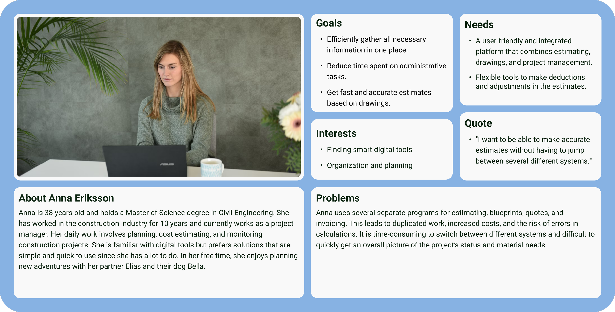
A persona was created based on the collected data to effectively represent the targeted user group. This allowed for a clear summary of user behavior, needs, goals, and challenges, ensuring that the design process remained focused on delivering the optimal user experience tailored to the right audience.
Component library
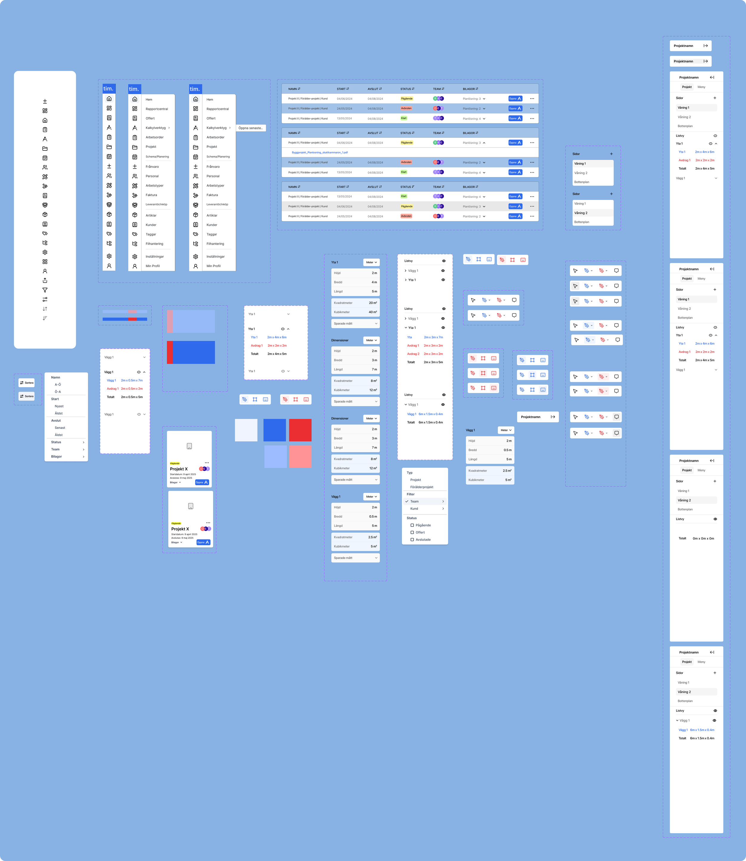
A component library was developed to establish a consistent visual language across the platform. It included reusable UI components that helped maintain consistency, streamline the design process, and make future updates easier.
REQUIREMENT LIST
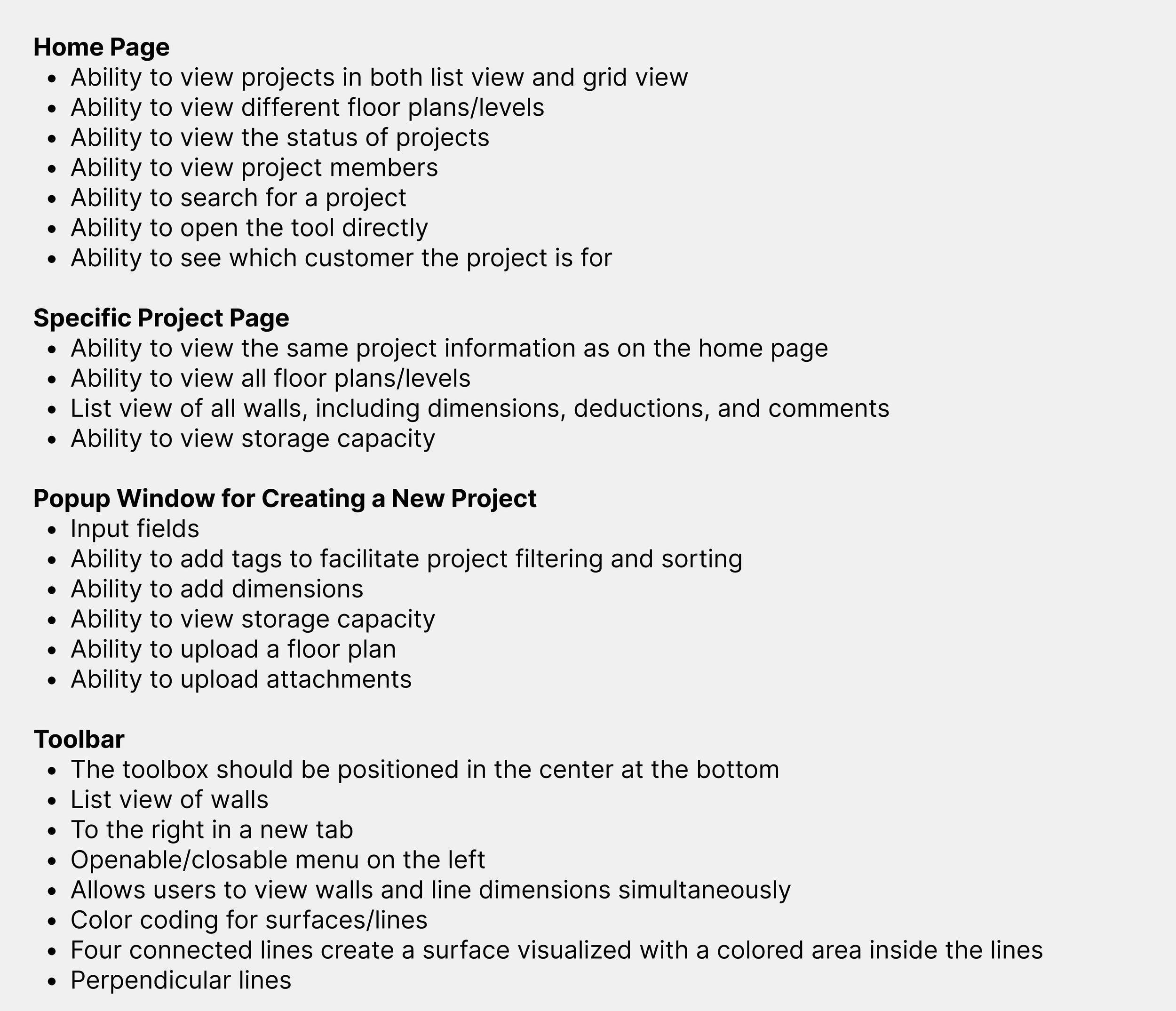
We created a requirements list to identify the key elements and functionalities that needed to be included. This helped ensure consistency throughout the system and provided a clear foundation for the design process.
WIREFRAMES
We created more detailed wireframes to define the structure, layout, and functionality of the platform. As we skipped the initial sketching phase, the wireframes allowed us to directly explore and refine the different screens, user flows, and key interactions before moving into the final visual design.
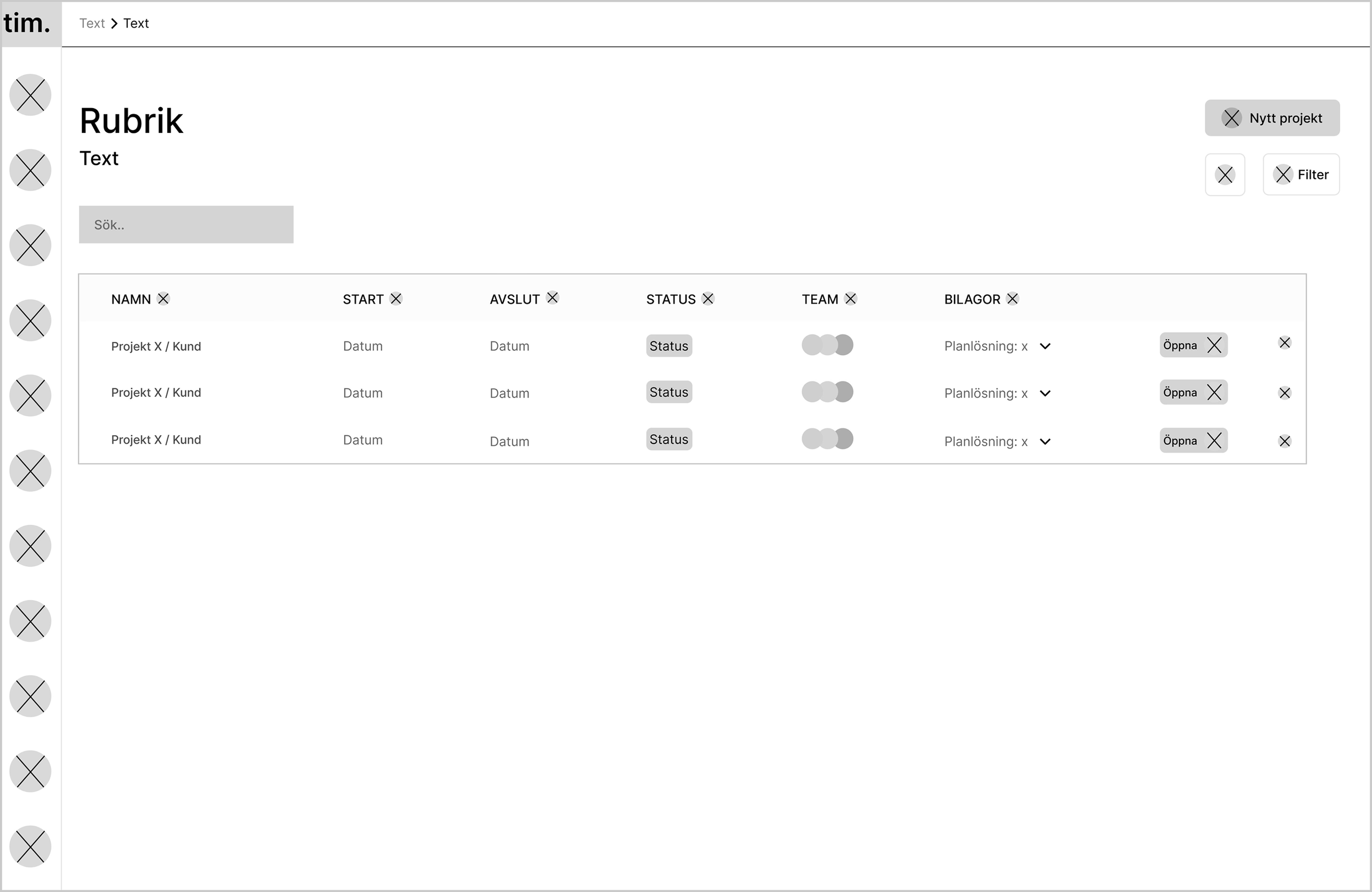
Home page - List View
The main view acts as the platform's central hub, giving users a clear overview of all construction projects with the flexibility to toggle between Grid View and List View. Shown here in List View, the structured layout allows users to quickly scan active projects and streamline administrative tasks. It displays essential project details including customer and project name, dates, status, attachments and team members while offering direct "Open" buttons to access the drawing and calculation tool immediately.
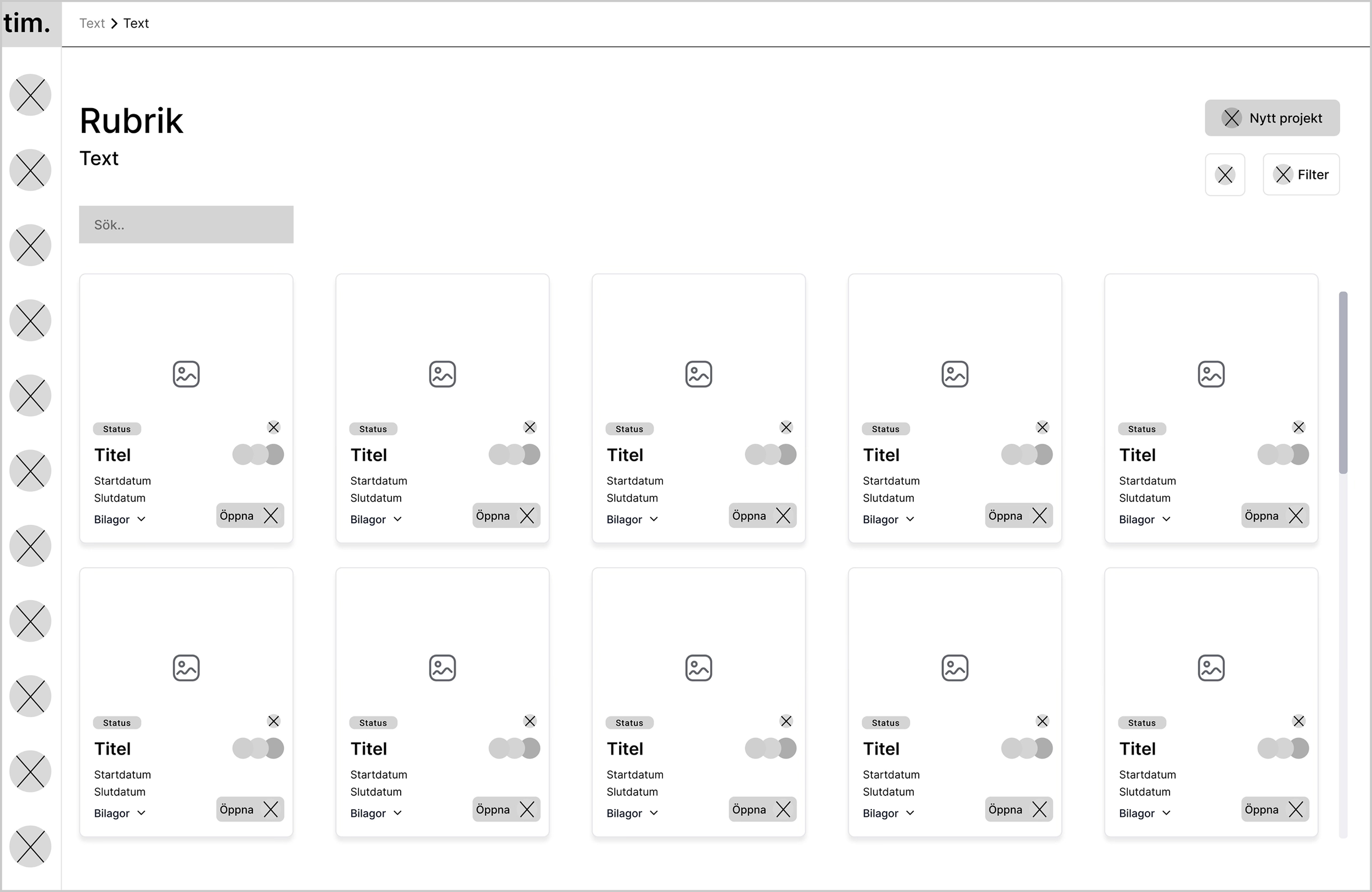
Home page - Grid View
Shown here in Grid View, the main view provides a visual, card-based layout that helps users quickly identify ongoing and completed construction projects. Each project card features a visual preview alongside essential details such as project title, status badge, start and end dates, attached floor plans and assigned team members. Users can filter or search through projects, toggle views, create a new project or click the "Open" button on any card to navigate directly into the workspace.
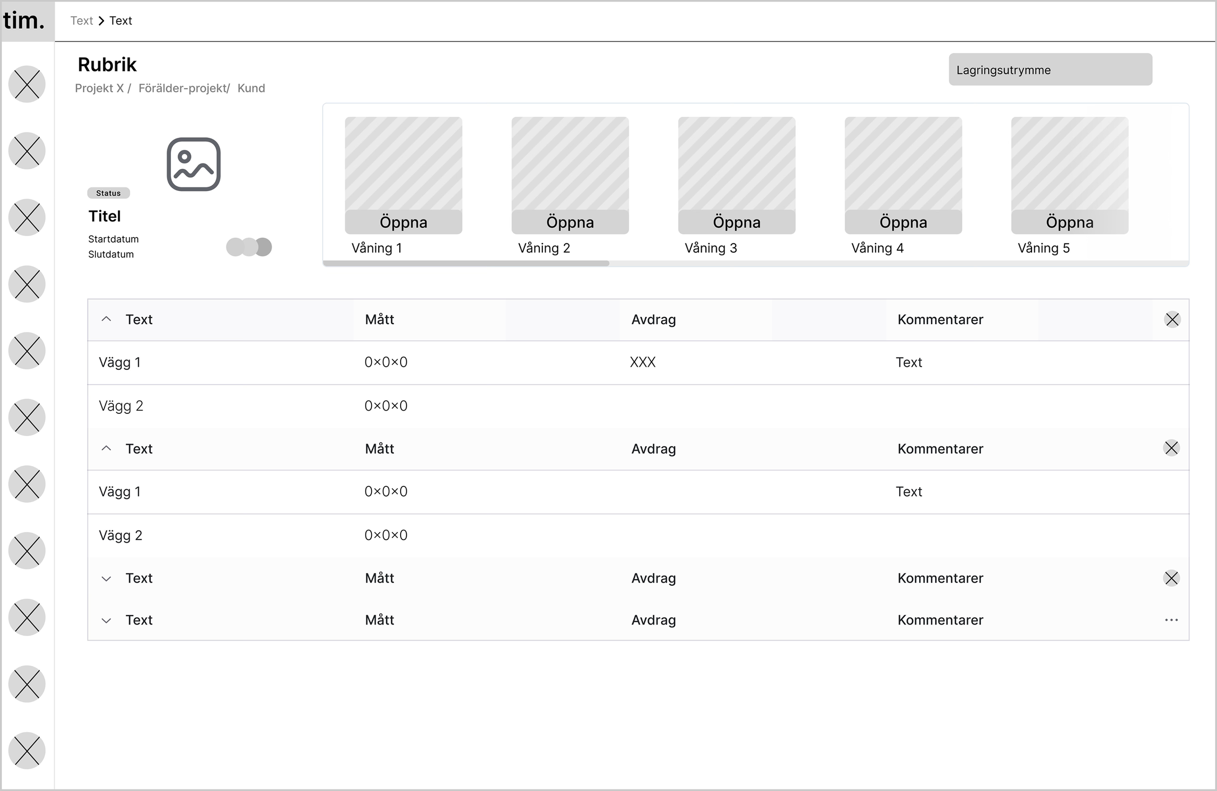
Specific Project Page
This page shows all information about a chosen project in one clear view. At the top, you can see basic details like the project name, status, dates, customer, team members, and total storage space used. A simple menu lets you click through different floor plans or building levels. Below, a table lists all walls with their exact sizes, deductions for things like windows and doors, and extra notes, making it easy to track every part of the work.
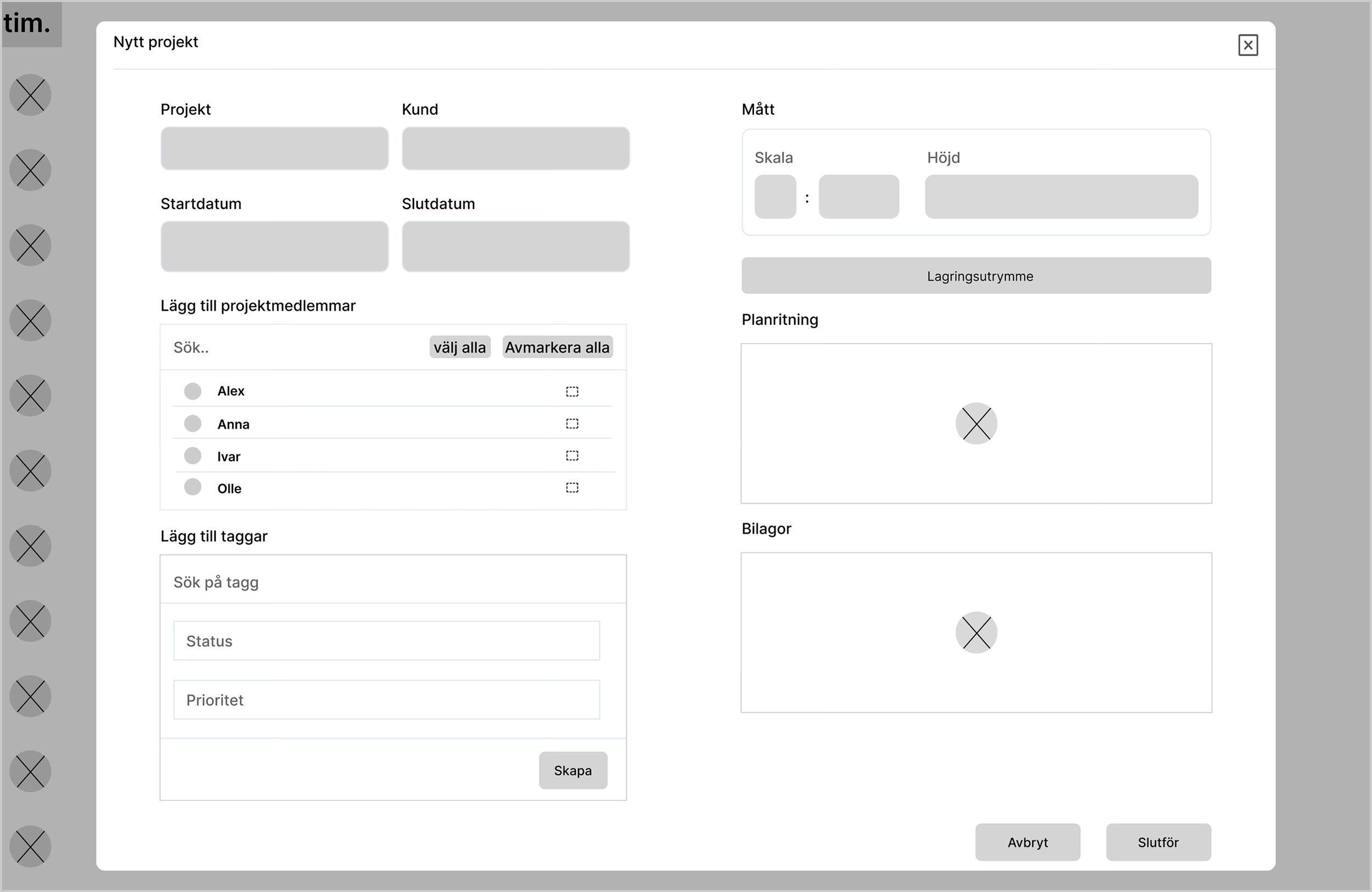
Create New Project Modal
This pop-up modal that is accessible directly from the home page lets users quickly set up a new project in a few simple steps. On the left side, users can enter basic details like the project name, customer, start and end dates, assign team members, and add tags for easier filtering. On the right side, users can set room dimensions such as scale and height, check available storage space, and upload floor plans or other important project files before saving.
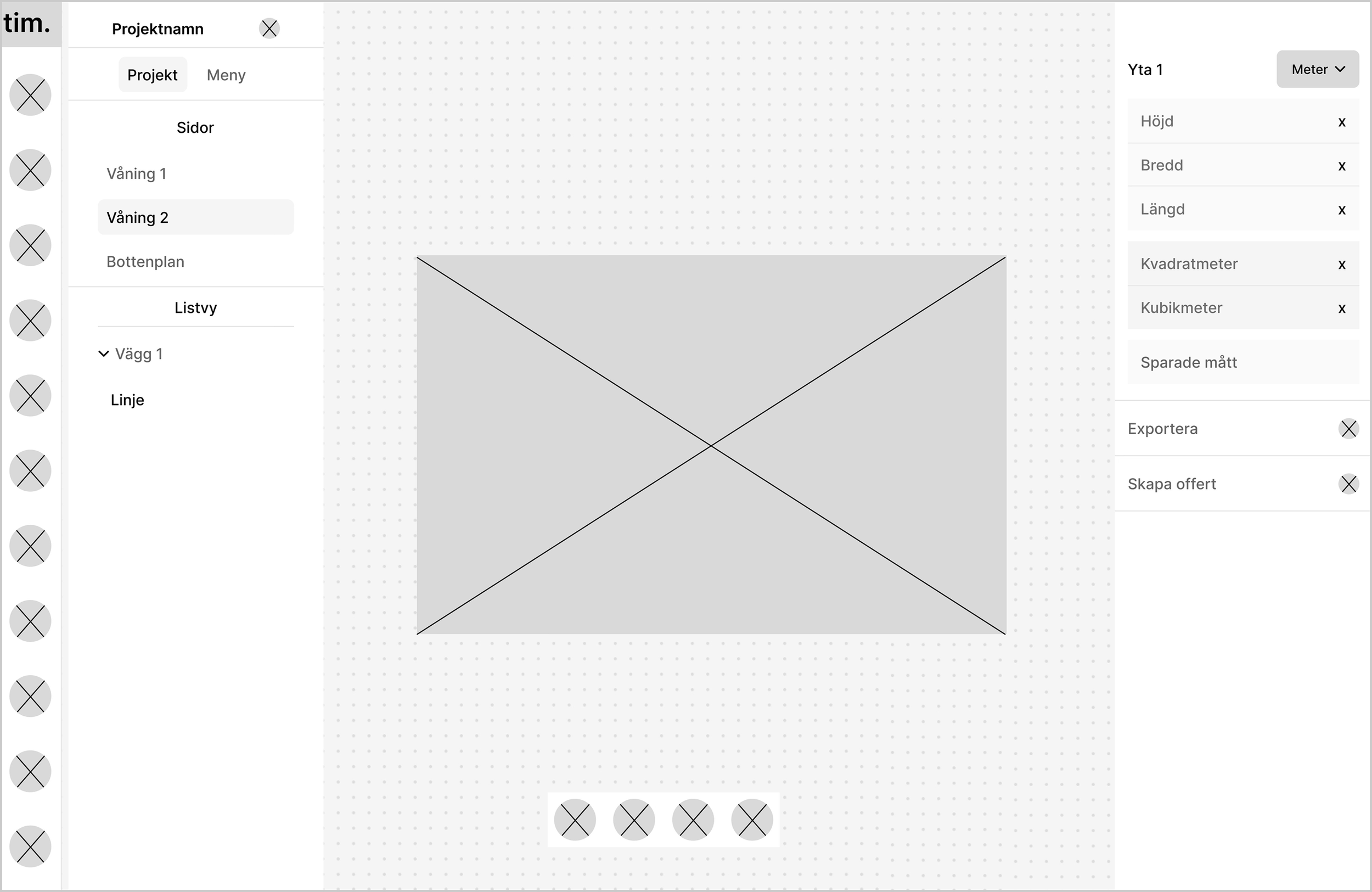
Interactive Workspace & Drawing Tool
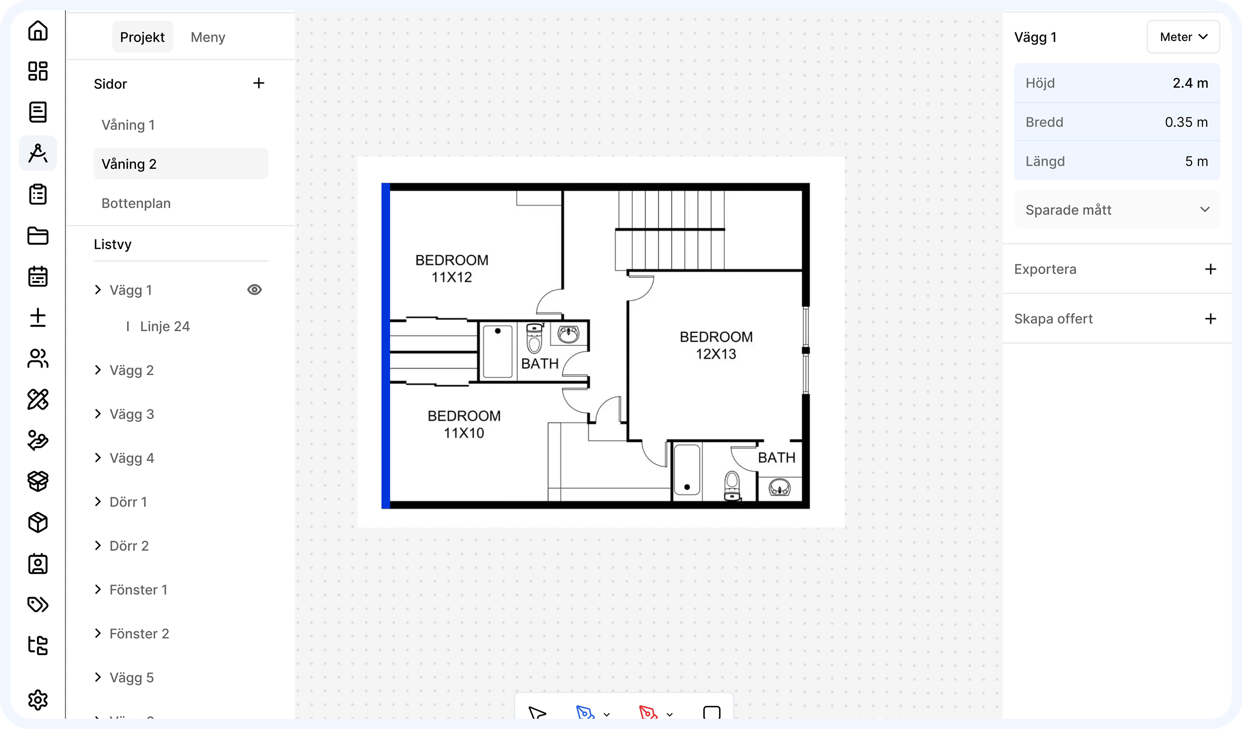
This page shows the main interactive workspace where users draw, edit, and measure floor plans directly. The floor plan is displayed in the center, supported by a floating toolbar at the bottom for quick drawing actions. On the left side, a collapsible menu lets users navigate between different floors or levels and view a list of created walls and lines simultaneously. The panel on the right displays real-time calculations such as height, length, area, and volume and allows users to easily export files and generate quotes directly from their measurements.
THE PRODUCT
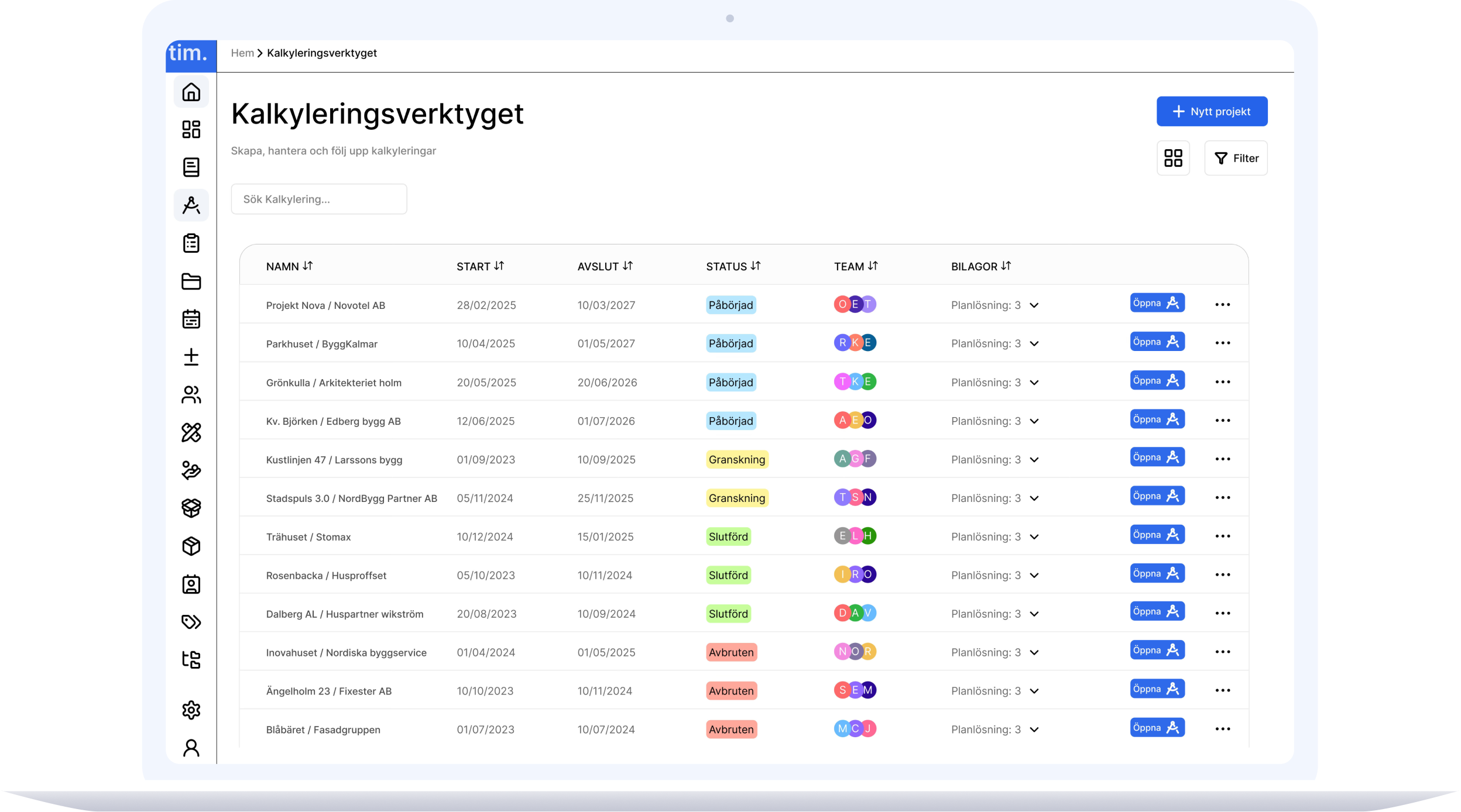
Clean and modern layout: Reduces cognitive load and makes scanning project data effortless.
Clear typography: Strong visual hierarchy allows users to quickly read complex data.
Color-coded badges: Instant visual feedback on project status (e.g., In Progress, Completed).
Intuitive team avatars: Vibrant badges show team members without cluttering the screen.
High-contrast actions: Prominent buttons guide users smoothly to key tasks like starting or opening projects.
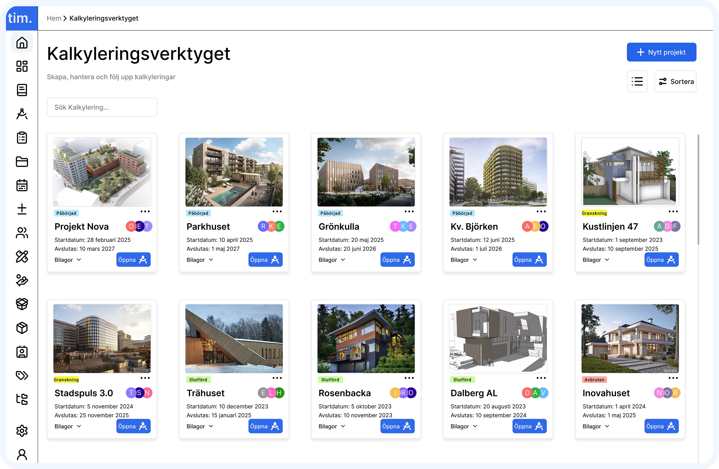
Visual card layout: High-quality image previews make project identification fast and intuitive.
Structured information hierarchy: Clear placement of titles, status tags, and dates for effortless scanning.
Color-coded statuses: Small badges instantly communicate project progress (e.g., Påbörjad, Granskning).
Consistent action buttons: Blue "Öppna" buttons on every card ensure quick navigation to the workspace.
Compact metadata: Team avatars and attachment dropdowns fit neatly without cluttering the card space.
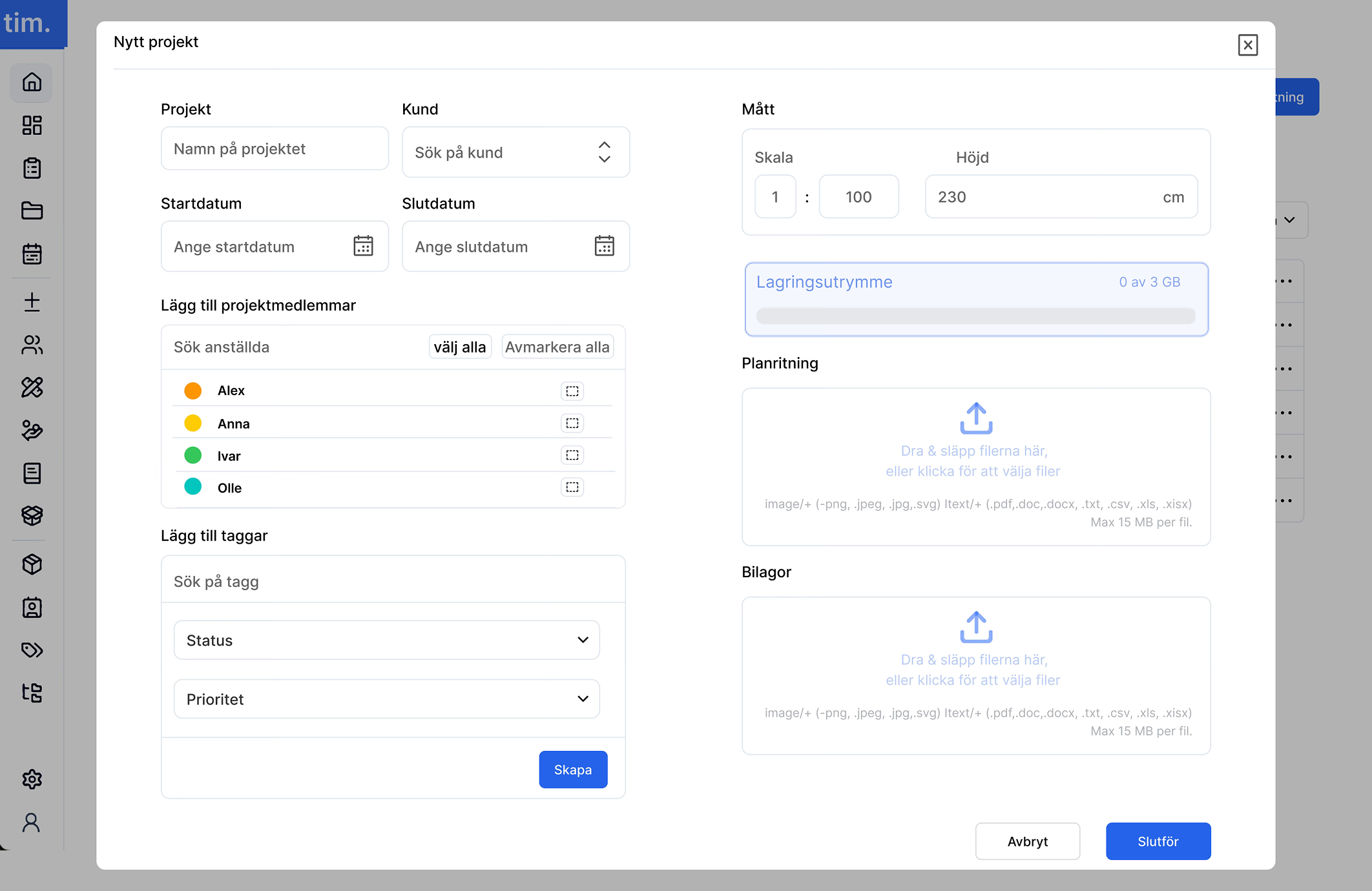
Clean two-column modal: Organizes project details and file uploads logically to prevent visual overload.
Intuitive input fields: Rounded text boxes, date pickers, and dropdowns ensure effortless data entry.
Drag-and-drop zones: Clear upload boxes with icon prompts make adding floor plans and files fast and simple.
Visual team selection: Member list with color avatars and quick actions ("välj alla") simplifies group assignment.
Prominent action buttons: Distinct primary button ("Slutför") guides users smoothly to finalize project setup.
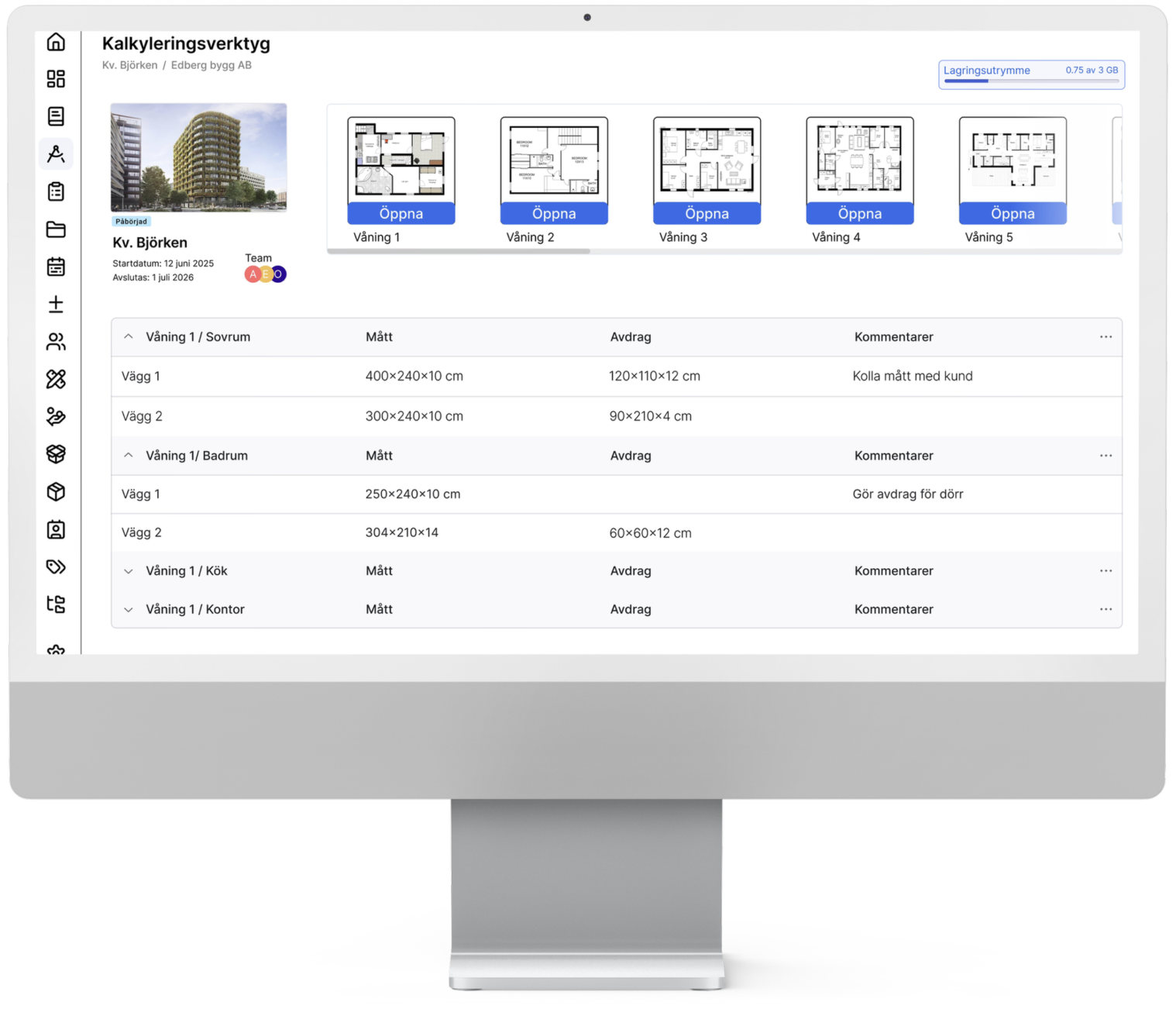
Specific Project Page
Vibrant selection highlight: The bright blue highlight instantly shows which wall is currently selected on the canvas.
Focused right-hand panel: Automatically displays real-time measurements (height, width, length) specifically for the selected element.
Structured element list: Left menu organizes all walls, doors, and windows into an expandable list for quick navigation.
Minimalist workspace grid: A subtle background grid keeps the floor plan centered and distraction-free.
Contextual action buttons: Direct options on the panel allow immediate exporting or quote creation for the selected geometry.
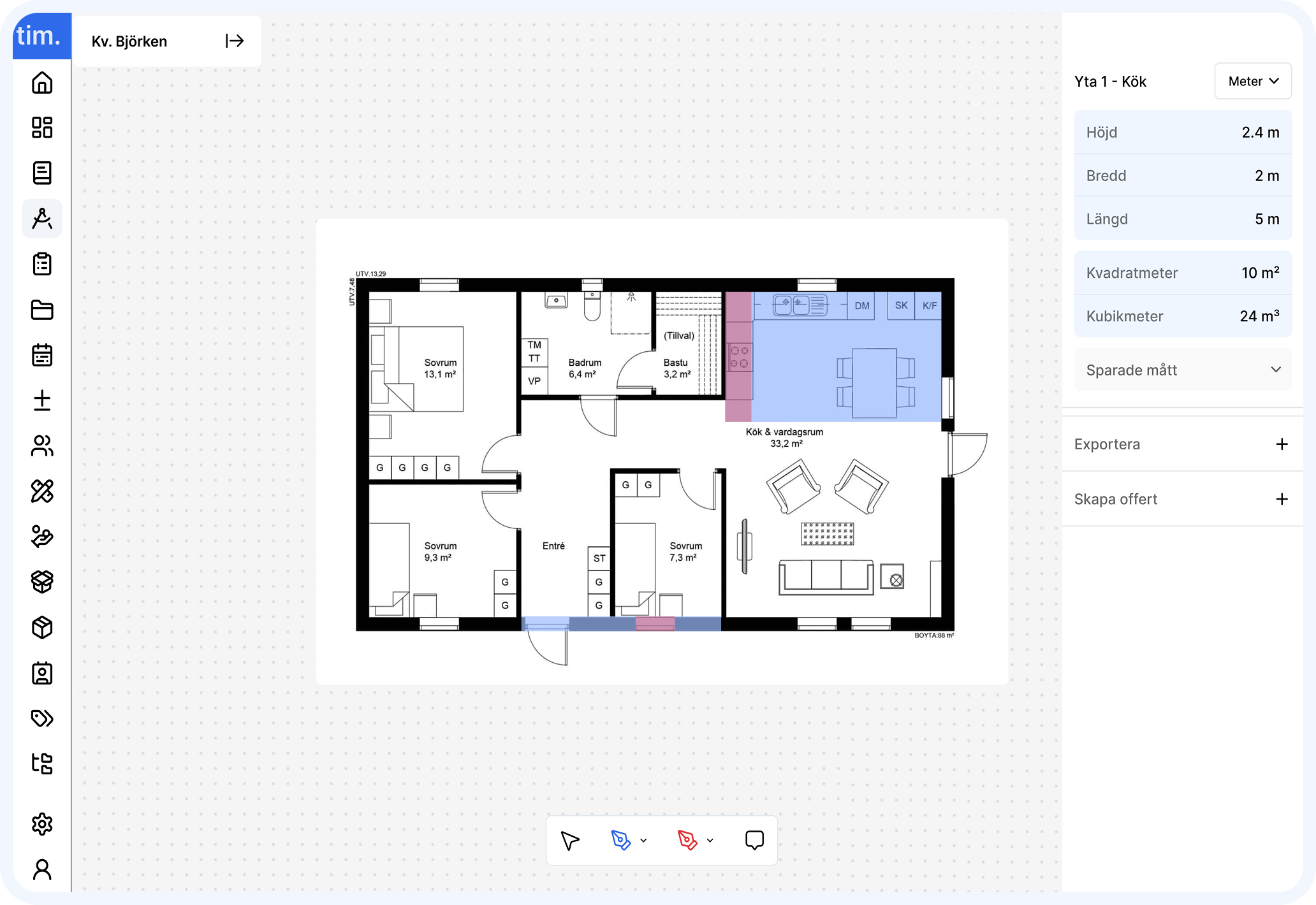
Collapsed side panel: Closing the left menu maximizes canvas space for an immersive drawing experience.
Clear blue selection: Highlighted surfaces and walls in blue instantly indicate active elements.
Red deduction markers: Distinct red highlights clearly signal deducted areas like windows or openings.
Live surface calculations: Right panel automatically updates room dimensions, square meters, and volume.
Streamlined floating tools: Quick toolbar at the bottom provides easy access to drawing and annotation controls.
What we did well
One of the main strengths of the project was creating a clear and structured foundation for a complex workflow. By first identifying the needs of the target users and analysing existing tools on the market, we were able to focus on the most important functionalities and avoid unnecessary complexity. The decision to combine several commonly used tasks into one platform helped create a more efficient workflow and reduce the need to switch between different tools. Detailed wireframes allowed us to carefully structure the different pages and user flows before moving into the visual design. Another strong aspect was the use of a component library, which ensured consistency throughout the interface and made the design easier to scale. Overall, the project resulted in a user-friendly and flexible foundation that can be further developed with additional features in the future.
What I would do differently
If I were to develop the project further, I would involve users more extensively throughout the design process. While the initial research and market analysis helped us understand the industry and existing solutions, more frequent usability testing with construction professionals could have provided deeper insights into their everyday workflows and needs. I would also spend more time validating the information architecture and user flows before moving into the final design. Testing different approaches earlier could help identify potential usability issues and ensure that the most frequently used features are as efficient as possible.